
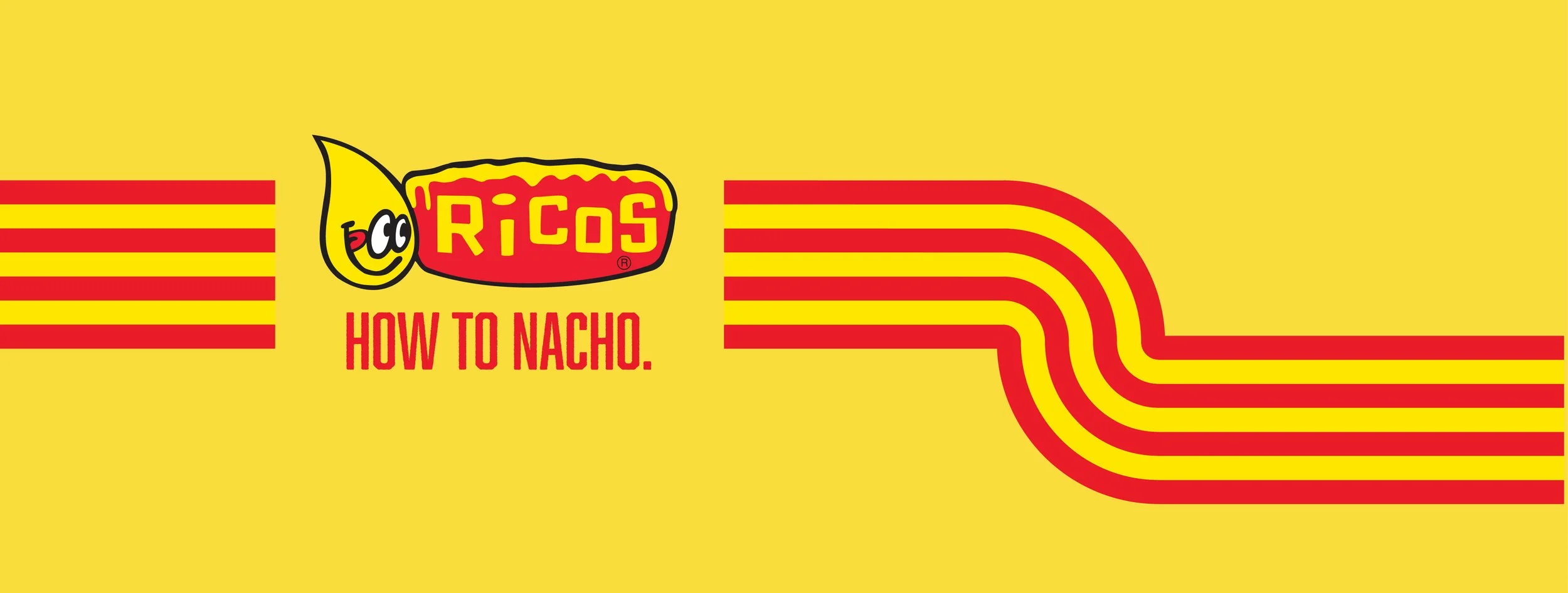
Make It Ricos
Campaign Art Direction for Ricos Products

The Strategy
The primary goal of this campaign was to establish Ricos as the authority in the nacho brand space. Ricos created the iconic concession nachos everyone knows…just not everyone knows that they know Ricos. Make It Ricos works to take the product recognizability and link it directly to the brand—Ricos is nachos, nachos is Ricos. The campaign consisted of two phases:
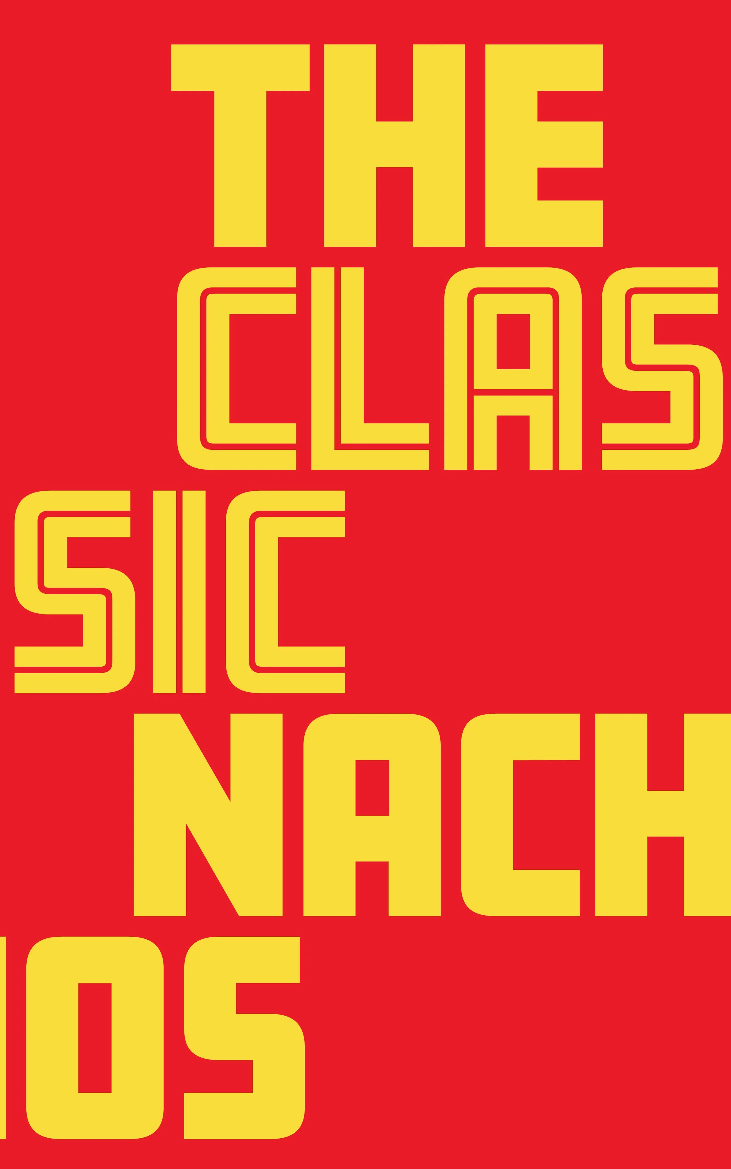
Phase 1: The Classic Nachos
The messaging of this phase focused on establishing Ricos as the nacho authority through the product’s history as well as the consumers’ nostalgic ties to their experiences with concession nachos. There was a heavy emphasis on being the “original” and the product which was presented in familiar ways so that customers would be able to equate Ricos with concession nachos.
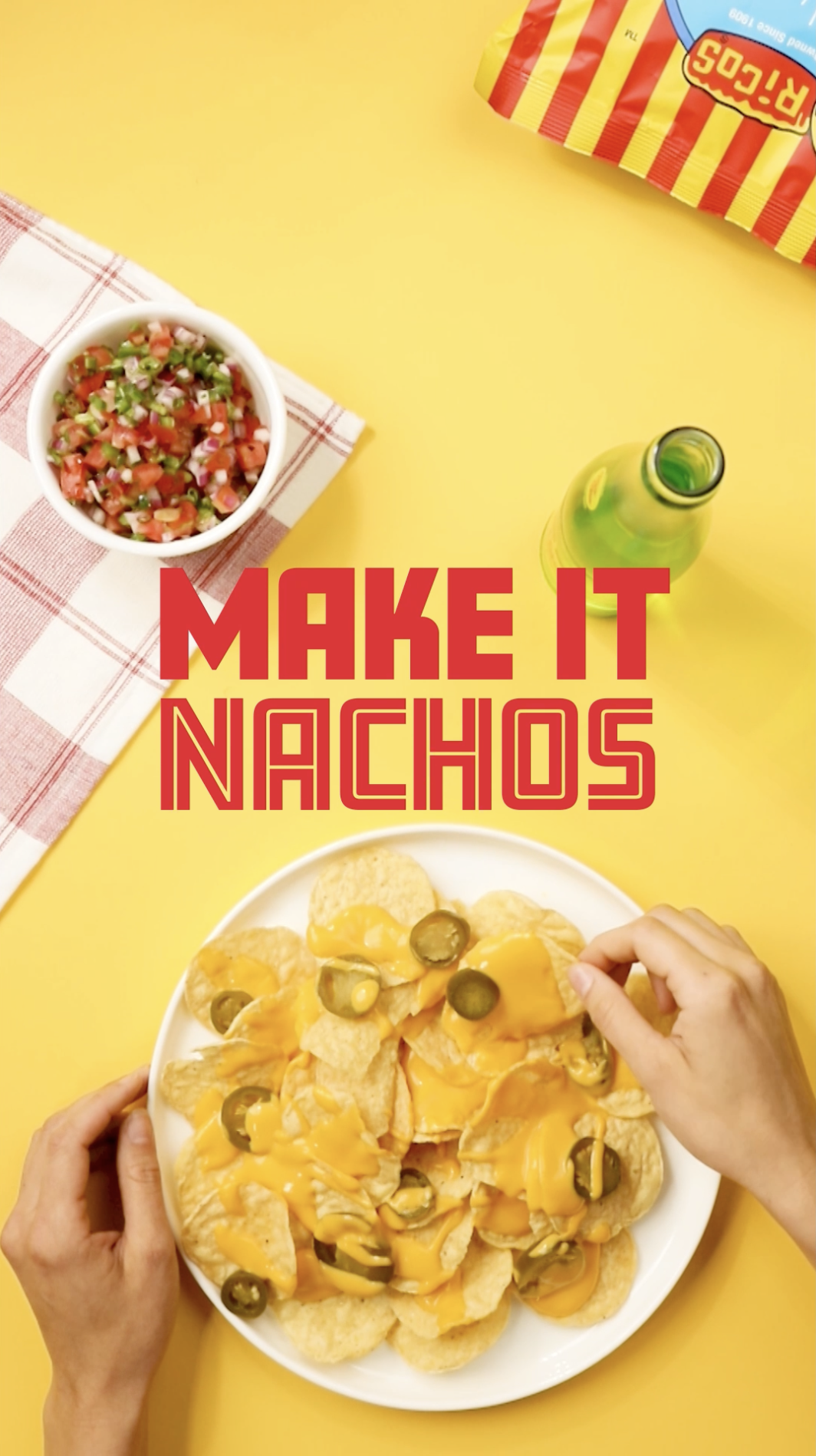
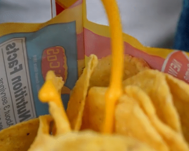
Phase 2: #MakeItNachos
This phase continued to reinforce Ricos interchangeability with nachos by highlighting Ricos’ products as the key ingredient that makes nachos what they are. On our social media platforms, we reinvented a number of other foods with a nacho-twist by using Ricos products for that classic nacho flavor. This was to inspire audiences to enjoy Ricos products beyond the concession stand by demonstrating their versatility and at-home use.
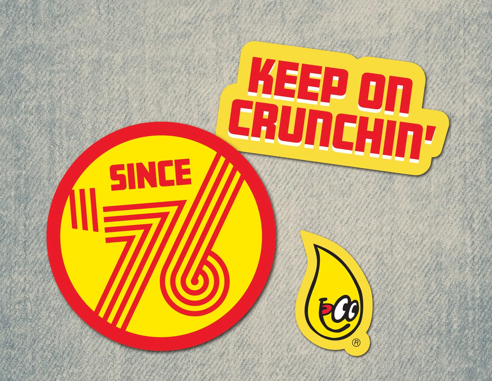
The Art Direction
Retro-inspired looks helped further establish Ricos as the original and a cherished classic. We specifically called back to 1976, the year the concession nacho debuted.
Photography and Video: Elias Segundo