
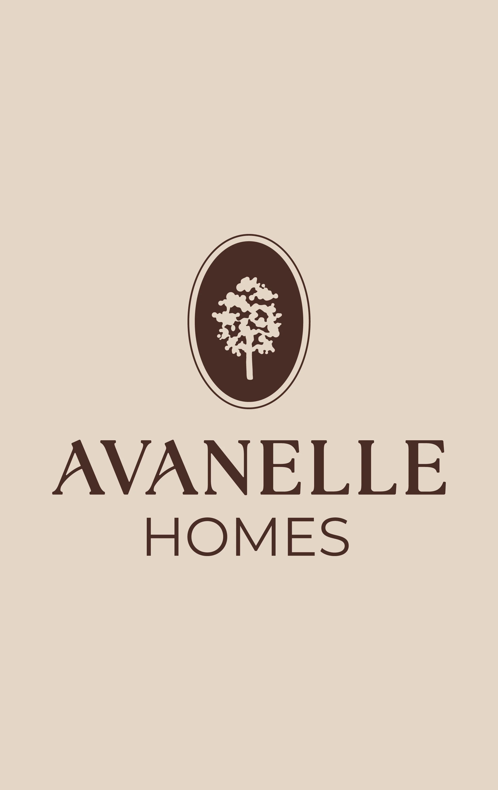
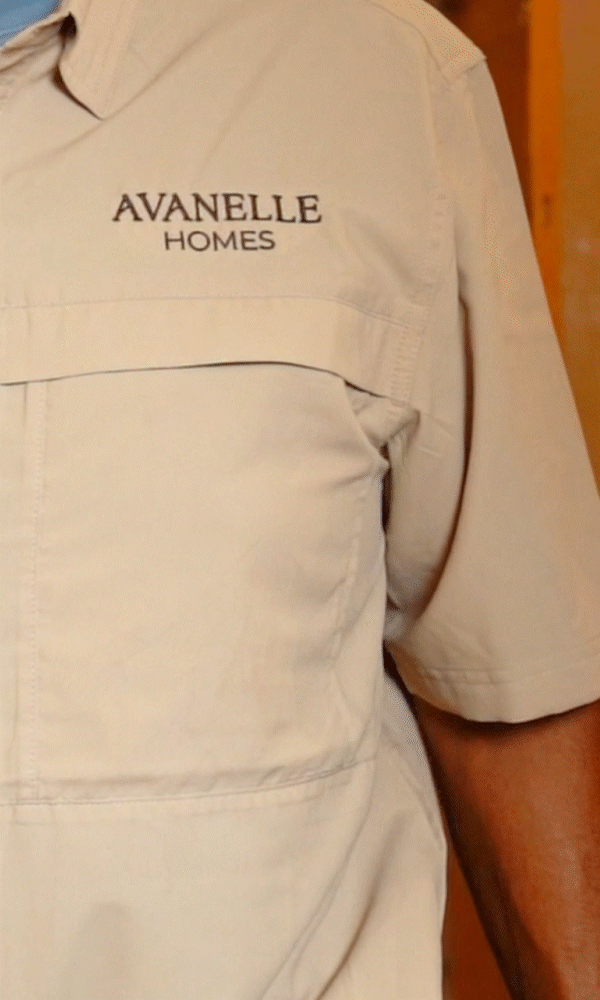
Avanelle Homes
Brand Identity


The Strategy
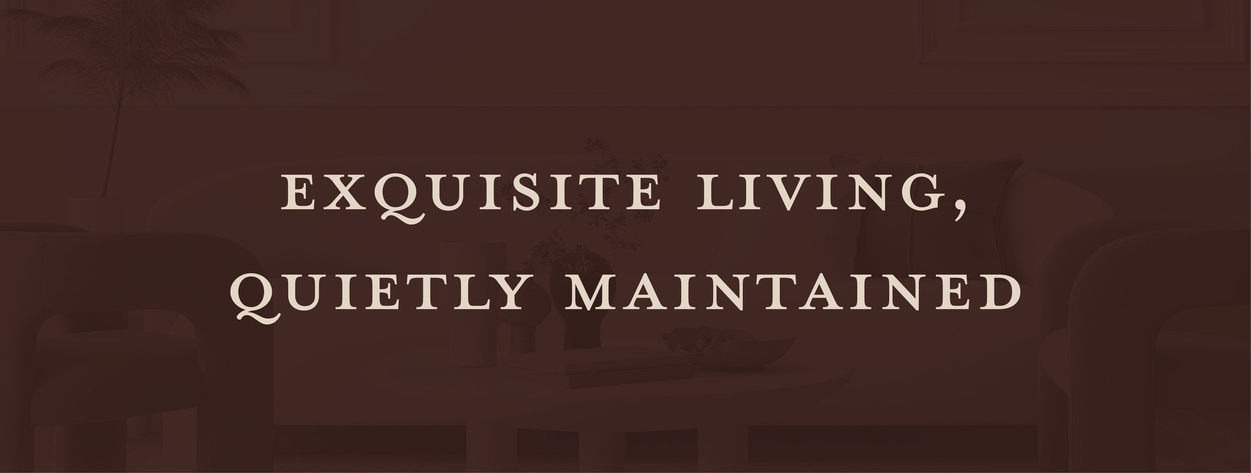
Avanelle Homes is a home services company founded in Alamo Heights as an answer to the question: should home maintenance really be so hard? Their position is a liberating, low-pressure approach to home services, providing excellent service quietly in the background of homeowners’ lives. No pushy sales, no complicated scheduling, and relief from the mental load of home ownership.
The Visual Identity: Quiet Connection
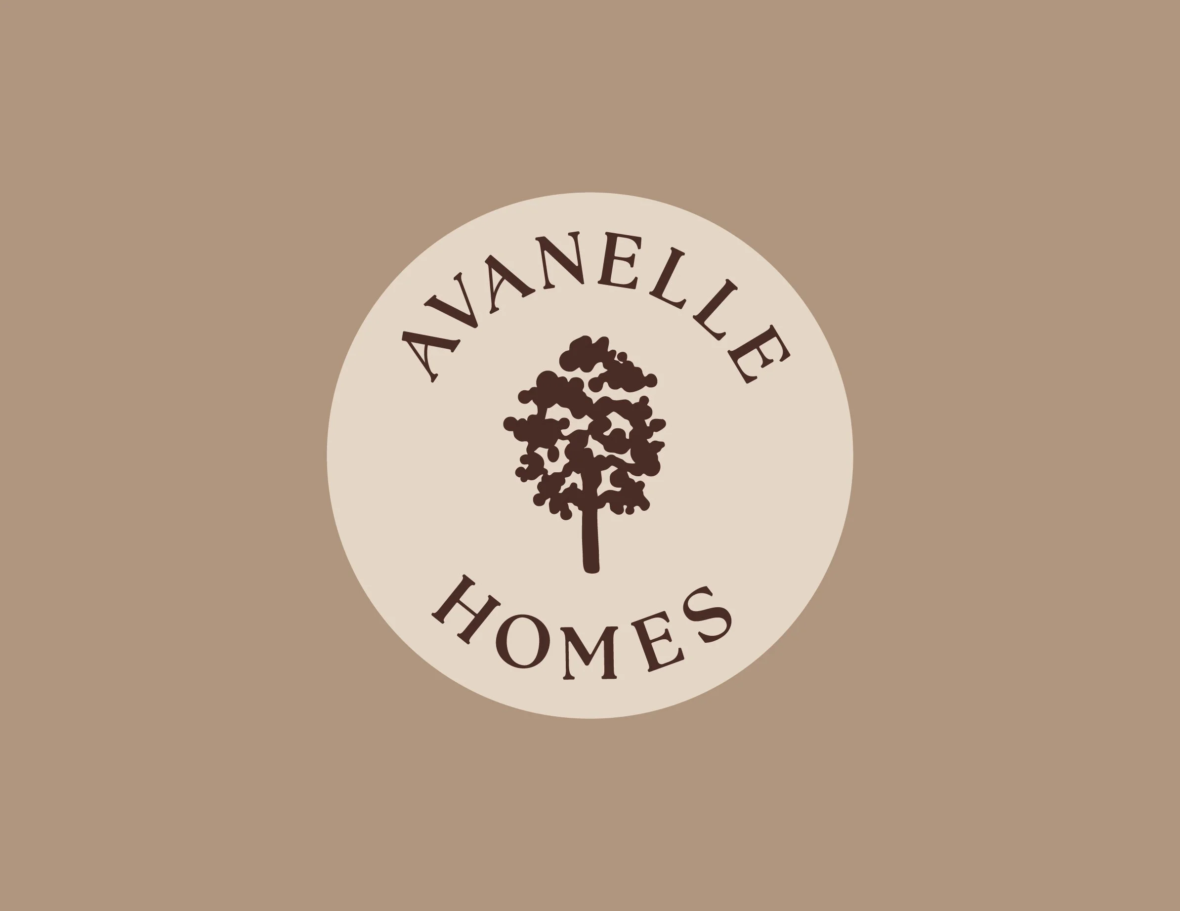
The mark introduces the strength and beauty of the oak, a visual staple for Avanelle’s clientele. Just like their extensive root system provides life beneath the surface, Avanelle Homes exhibits its deep care for their clients by working diligently behind the scenes. Hand illustrated for a human and relational touch, it is paired with a minimal customized typeface and submark that provides an elegant nod to their hospitality and attention to detail.
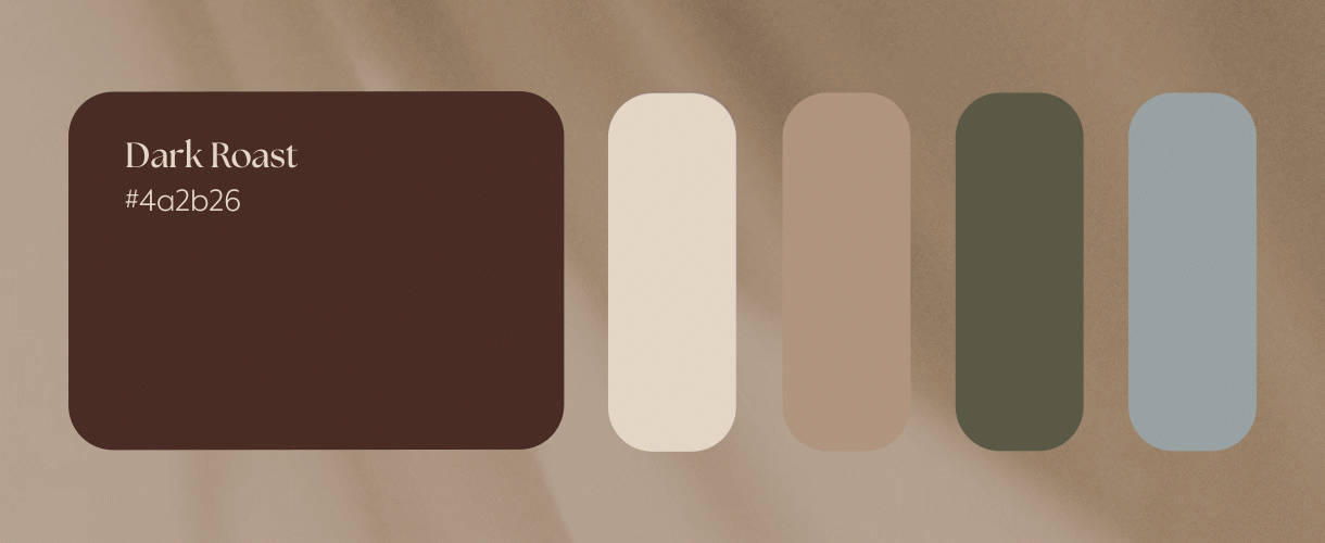
The brand’s primary colors are a rich brown and warm cream that are both subtle and strong, and distinguishes their brand in the home services market of bold primary colors.
Videography by Abe De La Rosa